


This is the most recent (and my personal favorite) of the 5 Formlabs shirts I designed since 2012. Fuse Rabbit is the classic 3D graphics test model, the Stanford bunny, wearing an “edge test,” an early 3D printing test model used by the Fuse team and later adopted as an unofficial internal logo for the project. This shirt was designed for members of the Fuse team following the first public reveal of the Fuse 1 and Fuse Sift at The Digital Factory in 2017.
I designed and screen printed the album art for The Perseverance Family Band’s debut album, Go Outside. The art was designed to fit on the CDs themselves and be printable with Gocco, a small Japanese screen-printing system.
To maintain a 60s/70s concert poster aesthetic, the layout was all done by hand using multiple layers of tracing paper to ensure that the composition still fit well on the CD.
The final mage for silkscreening needed to be a black and white photocopy, so this is the final inking layer in progress.
Using the clear protective CDs as a final layout tool and fit check. The CDs were aligned using a homemade registration jig in the Gocco machine. If it wasn’t aligned now, all 100+ discs would be off-center.
The great thing about silk screening multiple colors with a single screen is the ability to watch new psychedelic combinations appear over time. After all the cases were printed with green and metallic bronze, the discs themselves were printed with more vibrant neon color palettes.
Small batch manufacturing with the Gocco machine and improvised drying rack and work table
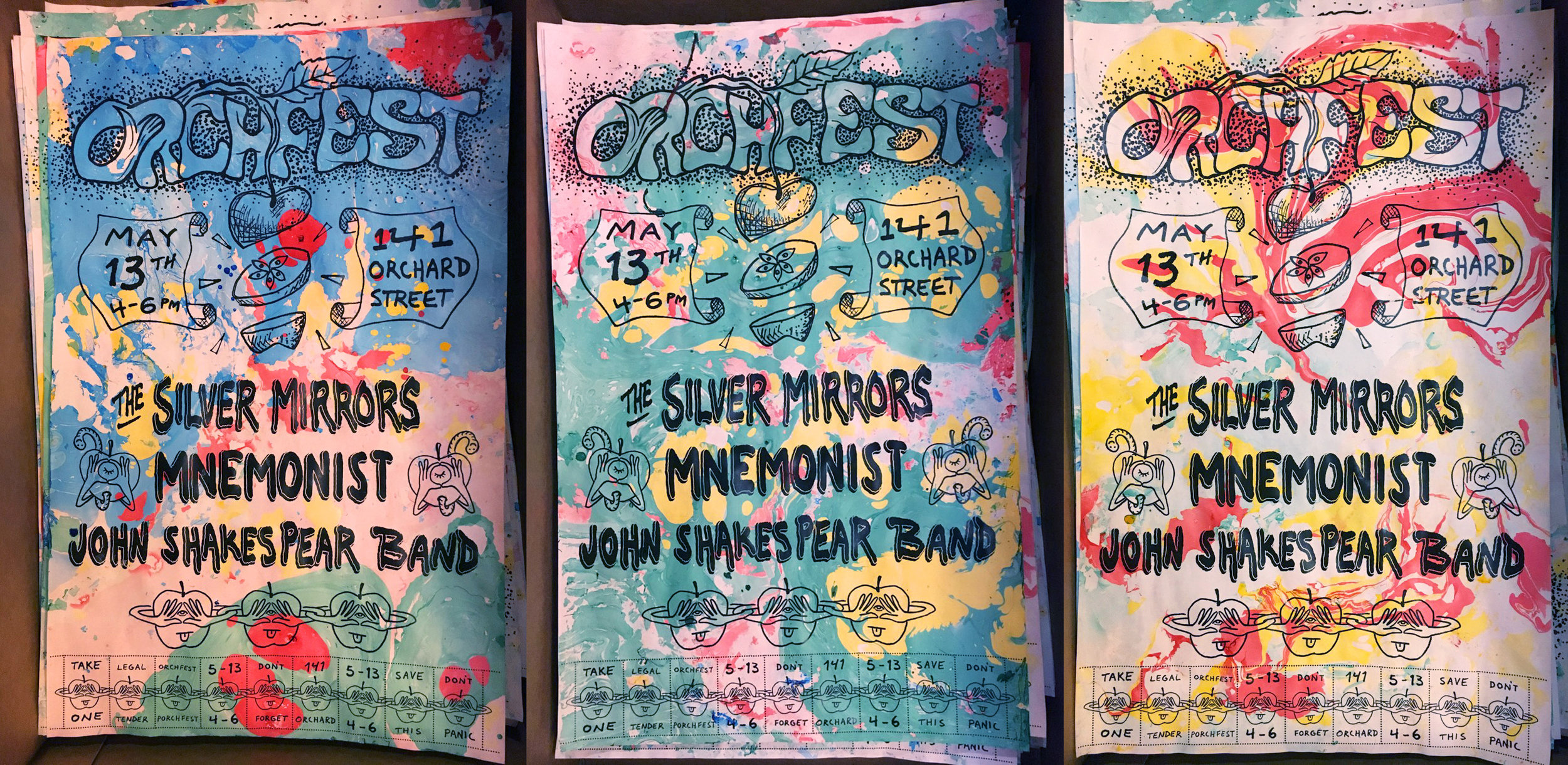
To promote the bands playing on Orchard St. during Somerville’s Porchfest, I designed and printed 50 11"x17" “Orchfest” posters and hung them around town. The posters were designed to be as cheap as possible to produce while still being eye-catching and unique. They were photocopied in black and white and then individually colorized using paper marbling techniques at a party and, to capitalize on the adult coloring book trend, extra black and white posters were given out to people who wanted to color their own.
To make it easier for the bands playing to promote the show on their social media accounts, I made versions of the poster art specifically for Instagram and the Facebook event page.
The second part of the Instagram Orchfest post
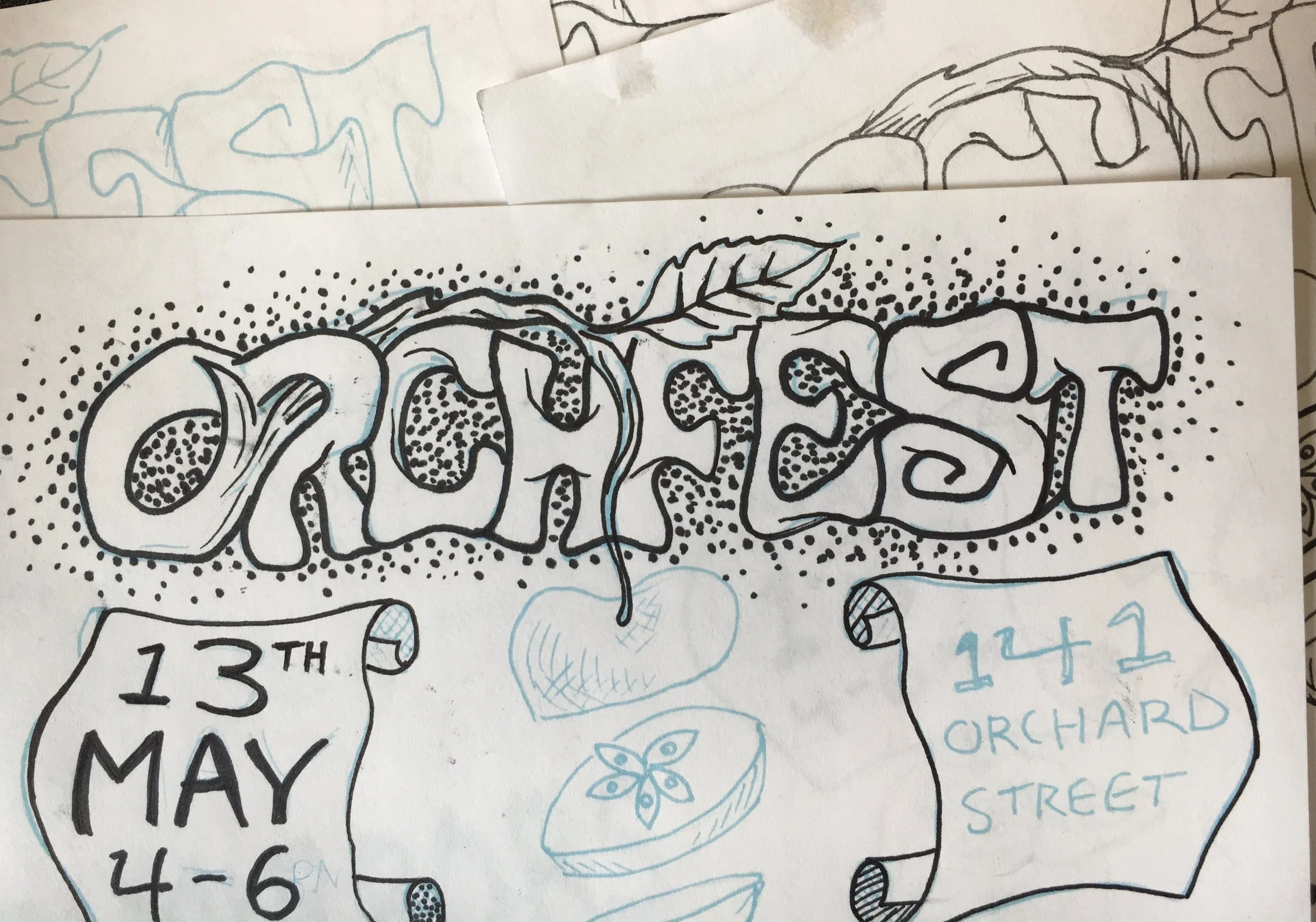
The process was similar to the process I worked out for the Perseverance Family Band album art, but I used layers in Photoshop and printed out iterations of the design instead of forcing myself to use only tracing paper. Additionally, instead of working 1:1 scale, I purposefully would draw much smaller and scale it up to capture more ink spatter and natural variability in the pen strokes.
In this iteration I’m inking over my previous version (printed out in light blue), but I don’t like how thick and tight the S looks especially next to the E.
In the previous iteration I didn’t like how thick and tight the S looked especially next to the E. Here I redo it to make it more consistent with the rest of the title, which ultimately was much closer to the final design.
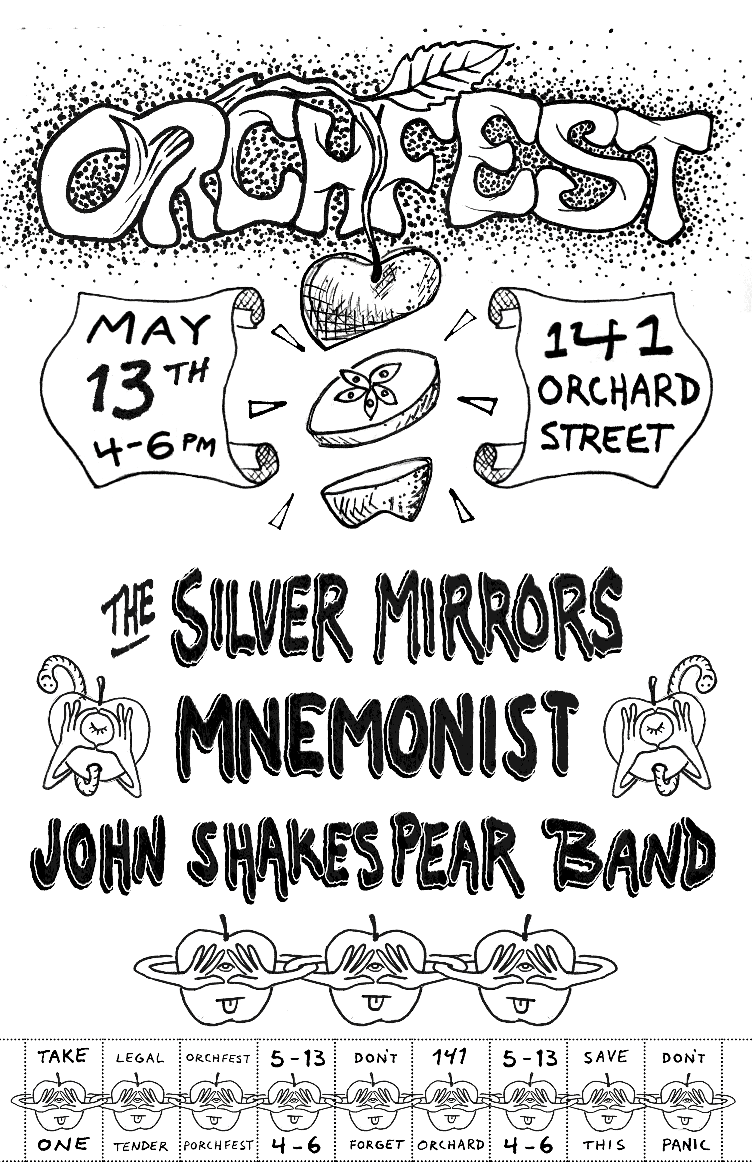
The final poster design in black and white ready for the photocopier.
The bottom of the posters had tear away tags created with a rotary perforating cutter. To encourage people to seek out the posters around town and take the tags, the “legal tender” tag was redeemable for a beer at the show :)